
Brand Identity
A brand refresh fit for a new era of energy supply chain intelligence.
Benchmark Mineral Intelligence, 2025
About Benchmark
Benchmark is the world’s leading price reporting agency (PRA) within the battery and energy supply chain space.
In 2024, it acquired demand-side start-up brand Rho Motion, allowing the company to offer even more holistic market coverage, from the mining of raw materials to demand-side production such as electric vehicles and energy grids.
The brief
I needed to refresh the Benchmark brand identity:
To reflect Benchmark’s enhanced product offering
To maintain brand awareness through co-branding, allowing Rho Motion customers to adapt to a ‘transitional period’ post-acquisition. This would allow customers from one brand to become familiar with the other brand, and by extension identify complementary products and services
To signify a collaborative and tech-focused new era for the combined brands
The legacy brands
Initial observations
Both logomarks are alike in the fact they feature simple, geometric shapes
Yellow and purple sit opposite each other on the colour wheel, offering an opportunity to create a bright and powerful new palette
Challenges to address
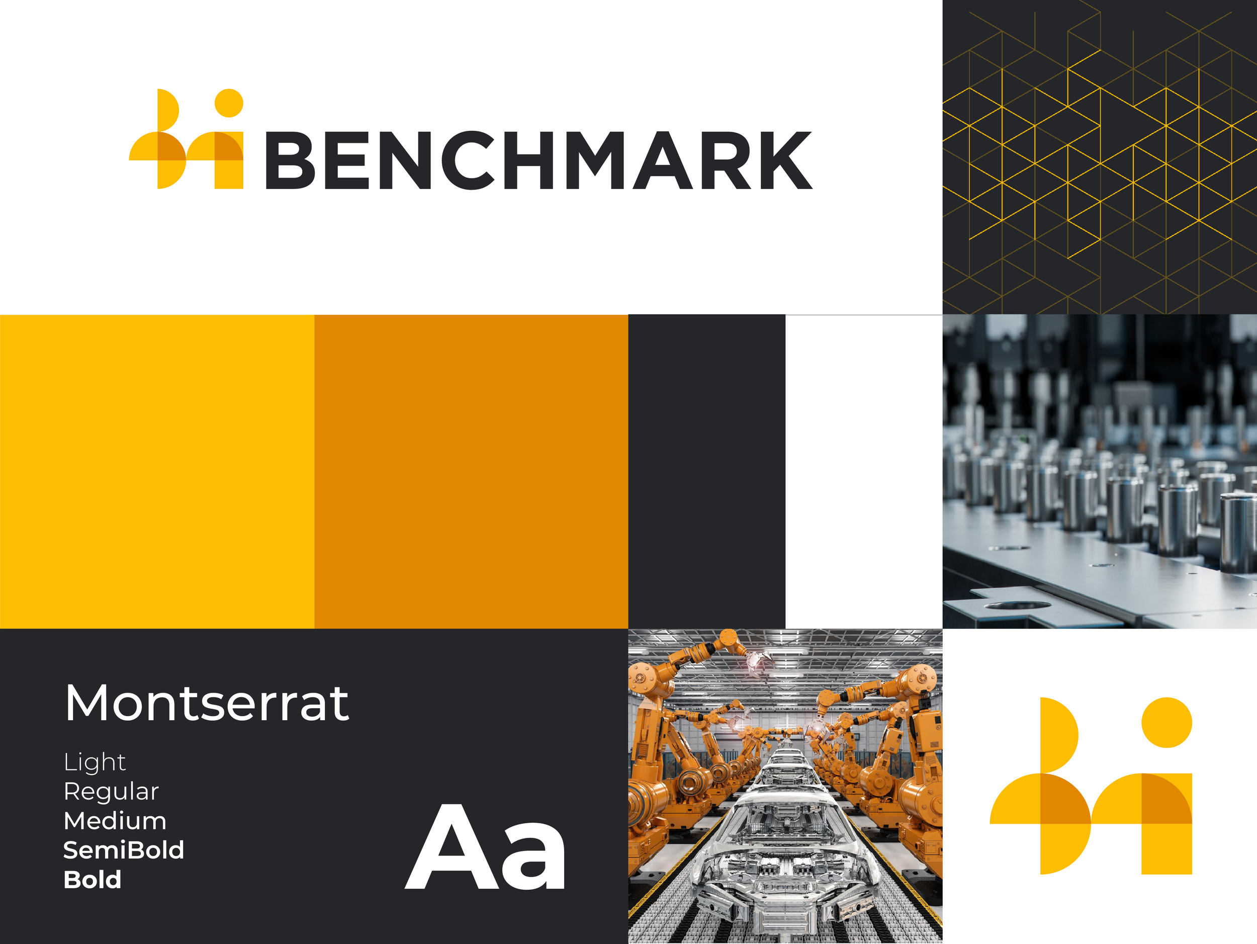
The legacy Benchmark branding could sometimes come across as dark and muddy
Both the Benchmark and Rho Motion legacy brands lacked full accessibility due to inadequate colour contrast in their palettes
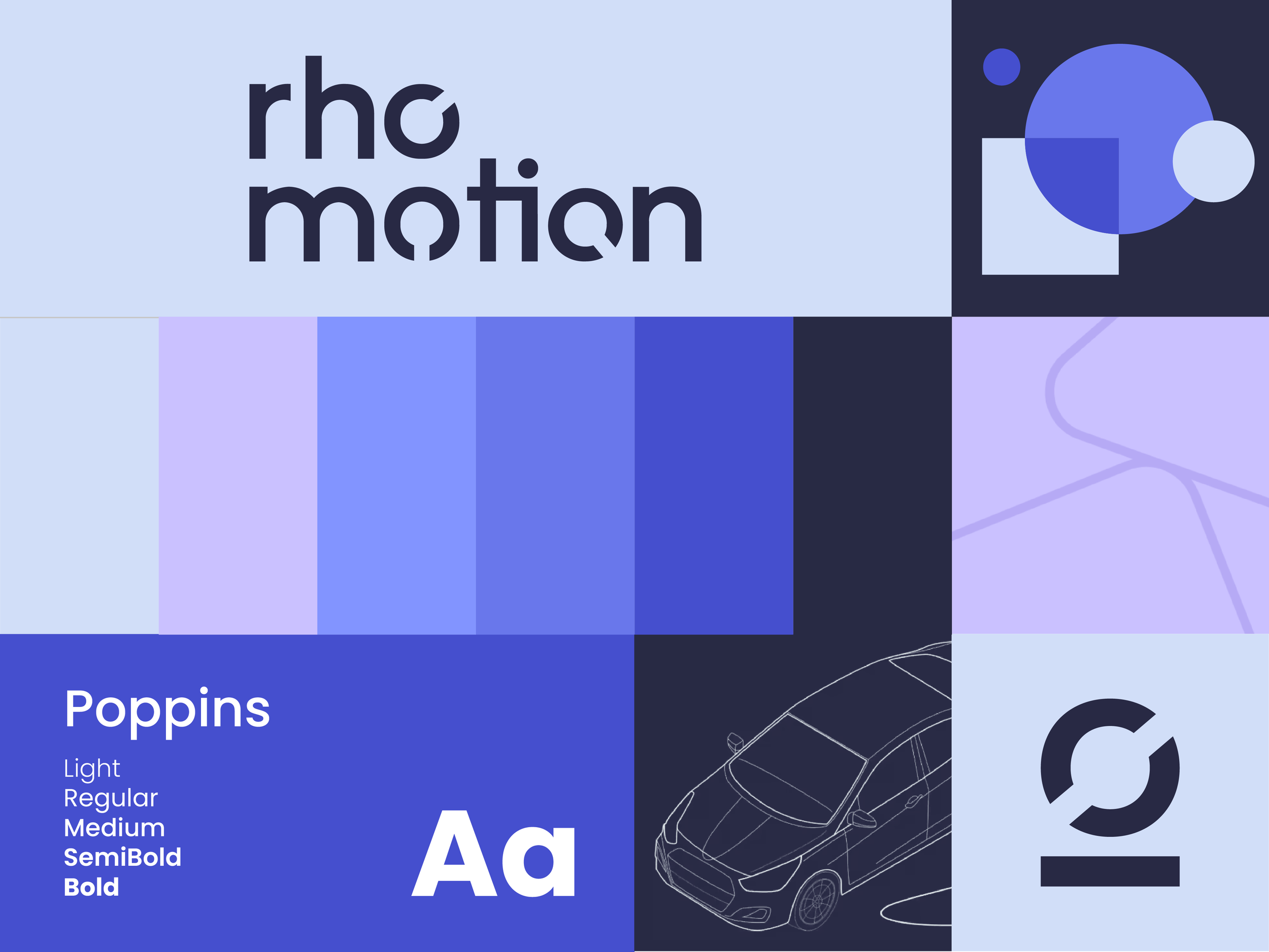
Benchmark’s visual style was largely photographic, while Rho Motion favoured illustration – I needed to combine the two
Process & research
Workshopping with c-suite & marketing team
We set out a vision for the updated brand look and feel which would align with new brand voice descriptors: Professional, Accurate, Authoritative and Punchy
We also discussed the importance of focusing on existing strengths: Deep industry knowledge, data storytelling and timely editorial insights
I prepared a first-stage moodboard which was presented to stakeholders
Fresh
The brand needed a new lease of life after 10 years of the same look and feel. Key to this was keeping colours bright to avoid muddiness.
Energetic
Benchmark is at the cutting edge of exciting developments in the transition to clean energy sources. It also prides itself on timely and reactive insights.
Harmonious
Marking a new era for both brands would require a colour palette which acknowledged the identities and key contributions of both Benchmark and Rho Motion.
Clean
It was critical to keep Benchmark’s industry-leading insights at the forefront of this refresh. This meant giving data breathing space to create the biggest impact. I proposed using much more white than our existing legacy branding.
Solution & impact
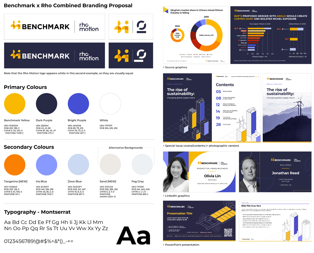
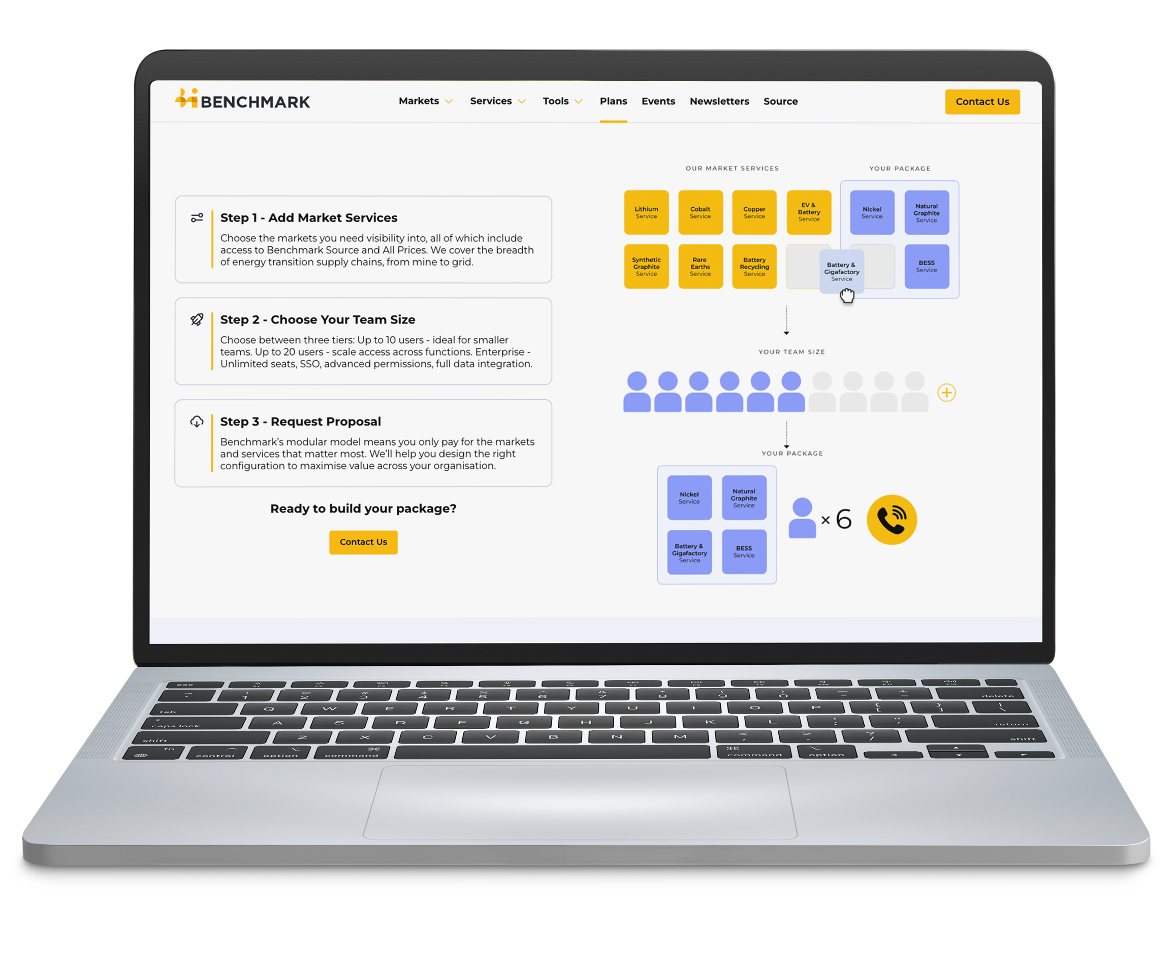
A fully integrated, co-branded identity that:
Showcases the enhanced, holistic product suite
Nods to both respected legacy brands’ identities
Defines a new era, with optimum accessibility
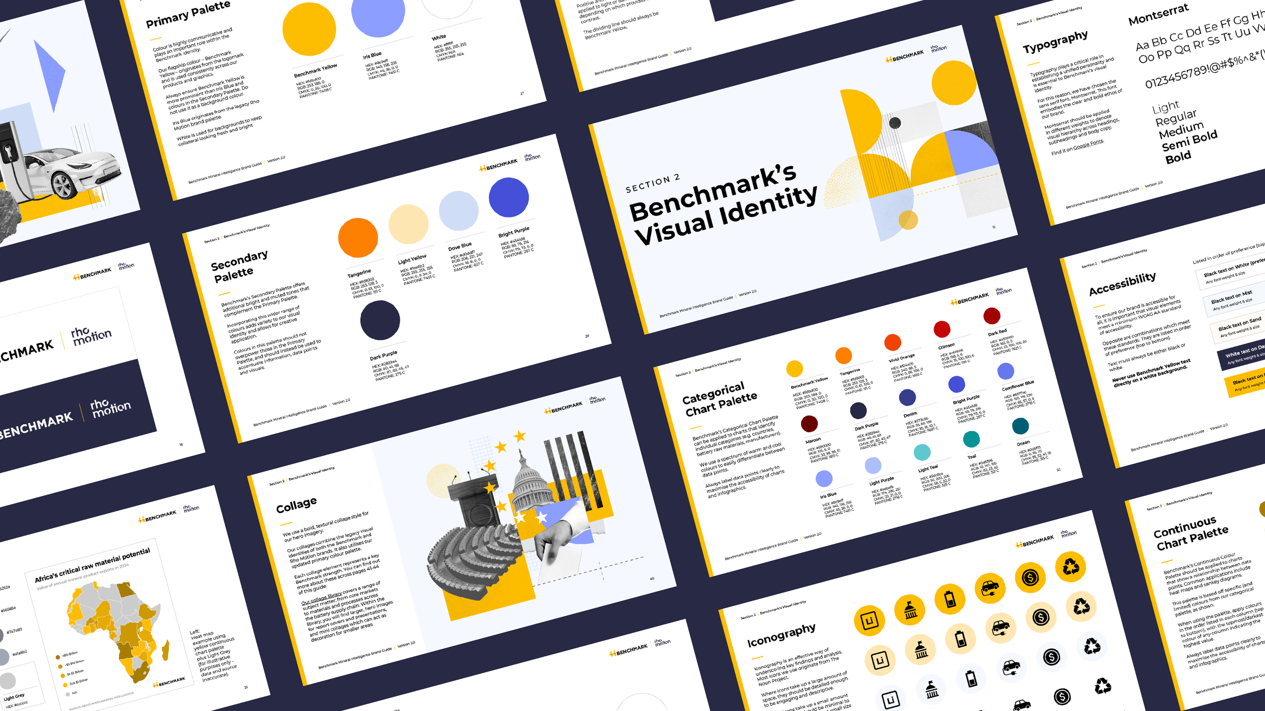
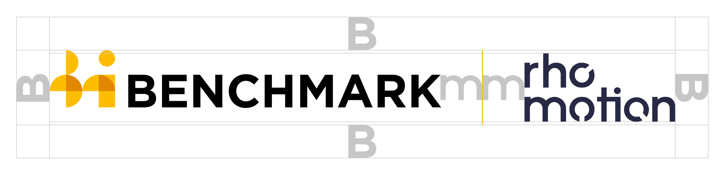
Reconfiguring the palette
Primary colours highlight the single most impactful colours from each legacy brand
Secondary colours provide a balance between Benchmark yellows and Rho Motion purples, allowing for wider creative application
Muted background colours maintain a light and fresh theme, while dark purple offers some differentiation and contrast where needed
Strengthening accessibility
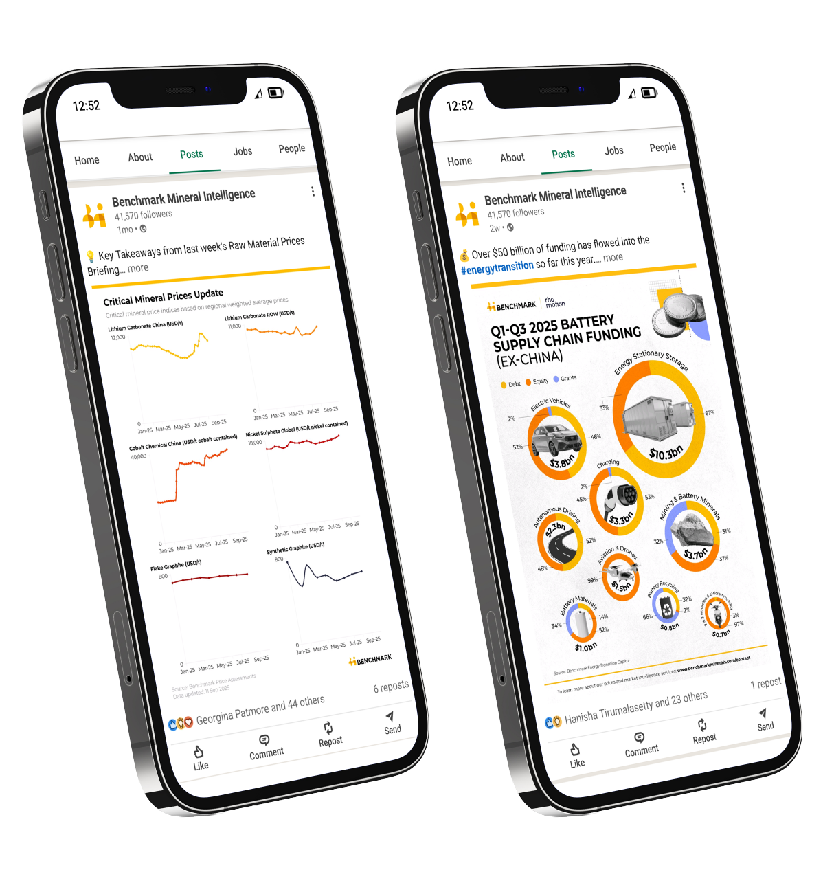
With a wealth of insights and self-serve data dashboards, it was essential to have plenty of additional colours available for data visualisation purposes
Fifteen categorical and thirty six continuous colours that offer optimum differentiation between data points whilst staying true to the heart of the brand refresh
To enhance accessibility further, data labels are included in all graphs, charts and infographics

Two brands, fully integrated
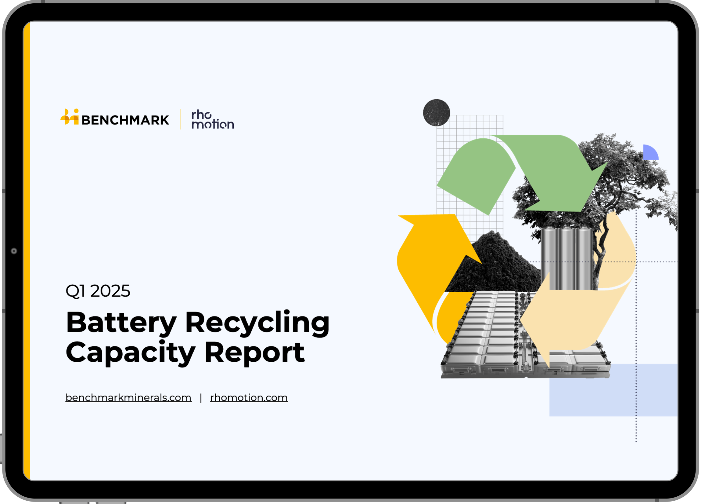
Experimentation led to combining the brands with a bold, textural collage style:
Grids and linework elements represent the data forming the backbone of Benchmark’s products
Filled shapes reflect logo elements from both brands, demonstrating their combined strength
Photography depicts industry subjects in a literal and intentional way, reflecting Benchmark’s goal to provide clarity across opaque markets
Paper textures acknowledge the essential role that editorial plays in the Benchmark brand story


“Lizzy brought outstanding organisation, creativity, and strategic thinking to this fast-paced, high-impact project. Her strong technical understanding of our niche industry allowed her to translate complex concepts into a brand system that spoke to our legacy audience with a fresh, forward-looking approach.
Throughout the project, she delivered high-quality work, managed timelines with precision, and met every challenge with calm professionalism. Lizzy was a key driver of the rebrand’s success.”
Hanisha / Design Lead, Benchmark Mineral Intelligence