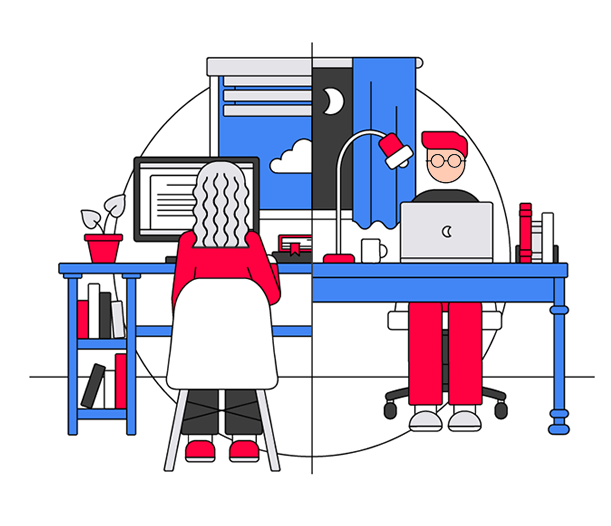
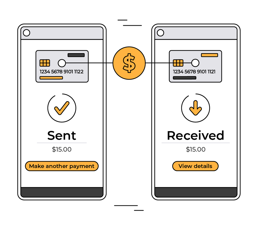
Illustration, Editorial, Social Media
Fostering meaningful engagement: Standout visuals for editorial.
Econsultancy, 2018-2021
About Econsultancy
Econsultancy is the go-to marketing and ecommerce upskilling provider for large, global organisations, providing them with expert-led learning programmes that have a measurable, meaningful impact.
The brief
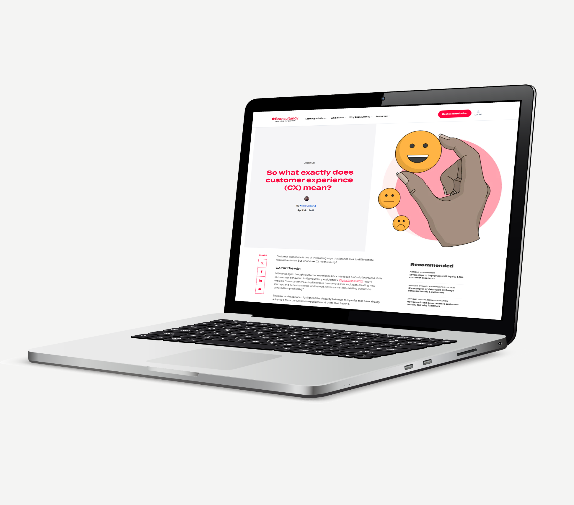
A distinctive illustration style for Econsultancy
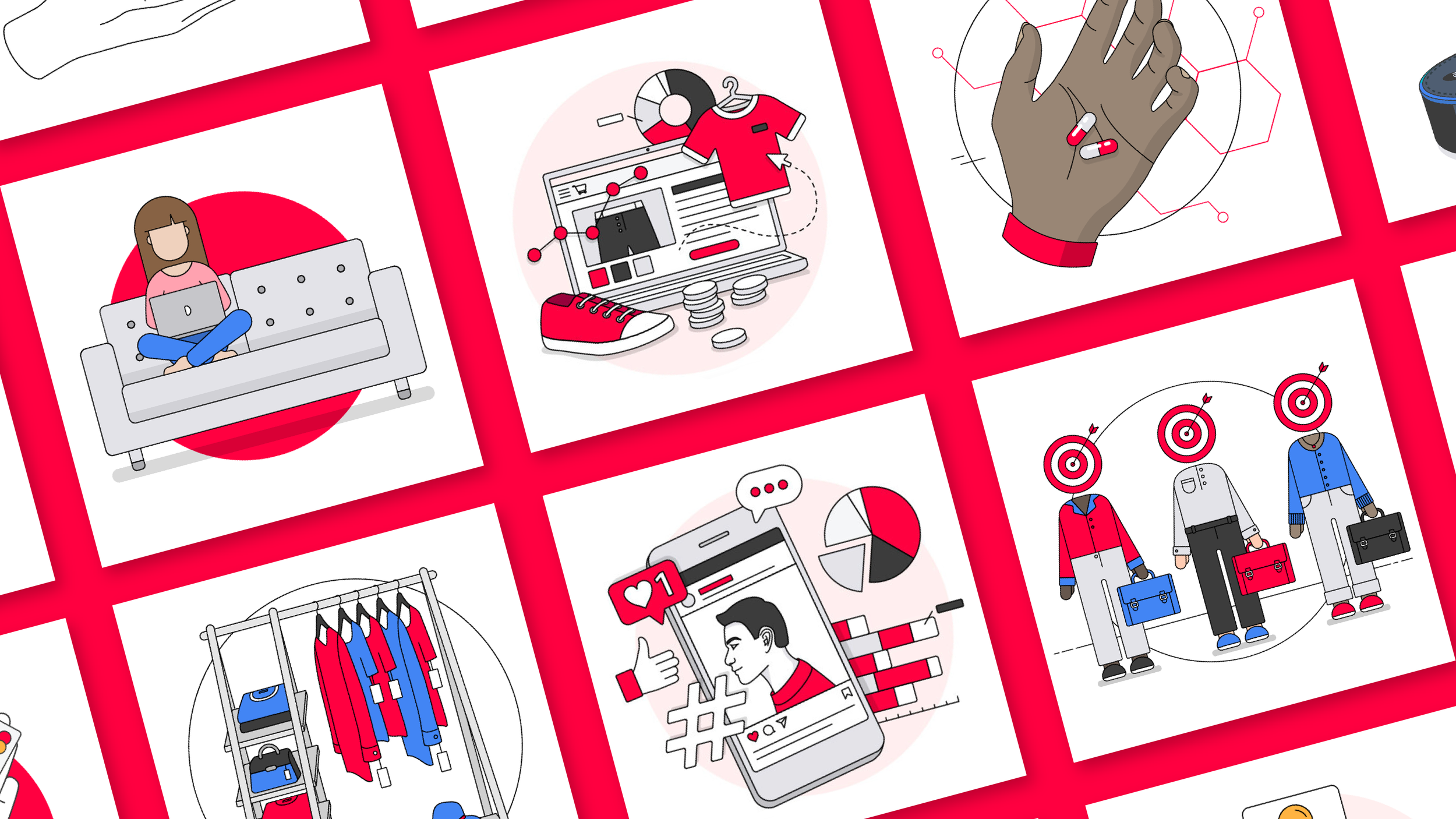
I was to develop an extensive, stock-free illustration library that aligned with the needs of the editorial, marketing and design teams. Previously, there was a huge reliance on photographic stock imagery to fulfil the visual gaps in its editorial content, social media posts and website. As a result, a large proportion of Econsultancy’s external-facing visual content was generic, repetitive and uninspiring.
We needed:
A distinctive, original illustrative style that aligned with the existing branding and colour scheme
A different style for paywalled articles that would be even more eye-catching, to drive subscription activations through the blog
Process & research
I wanted to echo some of the characteristics of the existing branding developed by the Design Lead, while adding my own twist that spoke specifically to editorial audiences.
The ‘Econsultancy circle’
The existing brand guidelines encouraged the use of stock imagery that incorporated circular subjects to reflect the shape of the Econsultancy logo.
I aimed to continue this theming but make it less restrictive, sometimes using circular shapes as a backdrop.
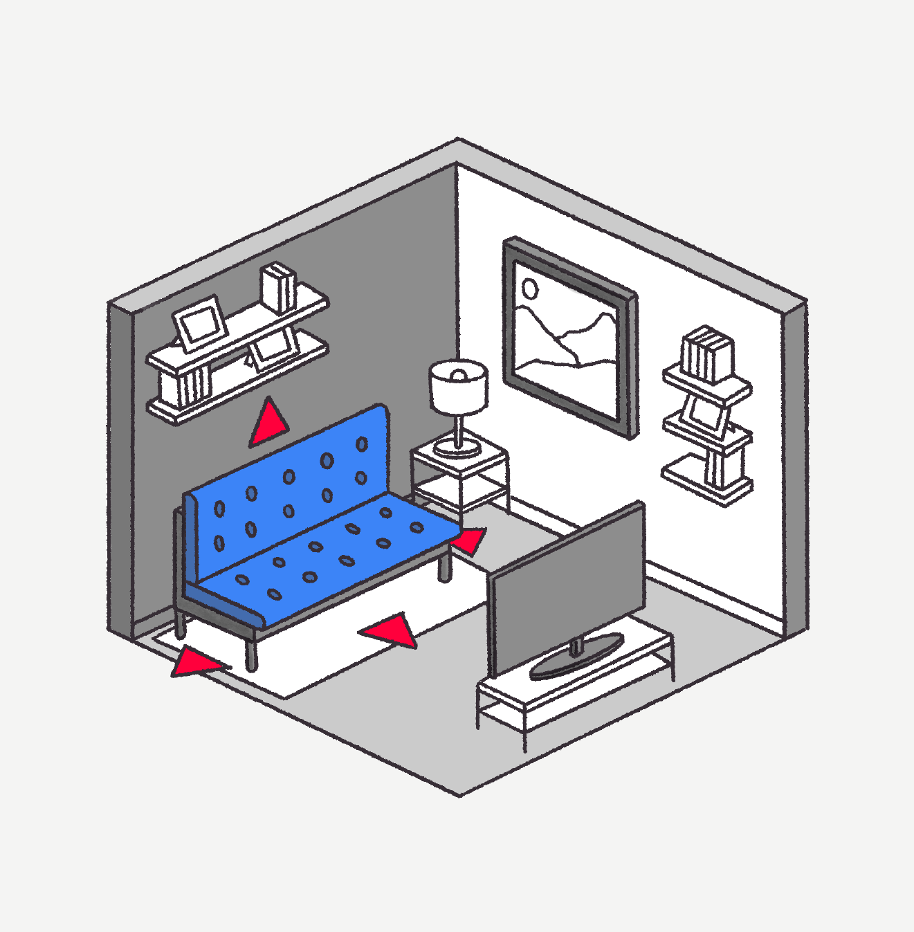
Adding depth to paywalled content
Paywalled content needed to look extra special. Most of our long-form content was subscription-only to drive sign ups through the website. I experimented with the idea of a greater depth of coverage in a visual way using 3D isometric drawings. These often started out as rough digital sketches based on the themes of each article.
Solution & impact
Directing website visits to paywalled content
I landed on an ‘Econsultancy red’ monotone styling for paywalled content, which would stand out significantly against social media feeds, and the brand’s website, which was largely white. Isometric angles gave the illustrations a standout 3D quality for further differentiation, and to indicate more in-depth coverage of the topics being broached behind the paywall.


Giving the brand a voice
Over time, my illustrations were applied not just on editorial pages, but across the entire site and on social media. Visits ticked up steadily, attributed to an increased presence of blog content (through a larger editorial team), our new visual style, and more frequent and strategic social posting.
In 2020, I took over as the lead for the brand’s social media strategy and creative output, meaning I had even more opportunities to test and iterate illustration styles for maximum engagement. Many of my favourite pieces found in this section were created during this time.
A landmark learning development project
I created similar illustrations for animation, enhancing a landmark interactive learning development project for one of Econsultancy’s largest clients, and bringing £170k to the business.