
Motion, Data Visualisation, Illustration
Showcasing the best analytics extension for Qlik Sense.
Vizlib, 2023
About Vizlib
Vizlib offers intuitive extensions for Qlik Sense (a leading business intelligence platform) to empower data-driven organisations to extend their analytics capabilities.
The brief
Vizlib’s most ambitious website overhaul to date
Alongside the web team, which covered the UI/UX development, I was tasked with supporting this 4-month long project by providing motion graphics and illustrations for use across the pages of the site. Our goals were:
To showcase Vizlib’s powerful products prior to its £multi-million acquisition by insightsoftware
To enrich the visual appeal of the Vizlib website with standout motion graphics
To improve understanding with impactful mockups/illustrations of its product interface
To increase conversions to MQLs post-launch to hit end-of-year targets
Process & research
Findings from user testing
Difficulties navigating the website to find specific information
Difficulties understanding the product due to extensive copy
Screenshots of the product were poor, cluttered, and did not provide enough extra context
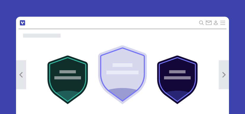
Several collaborative meetings between marketing, the web team and myself were conducted to tackle these challenges. It was agreed that I would create clear and consistent UI illustrations, icons and thumbnails, enhancing context. We’d remove the existing screenshots.
Solution & impact
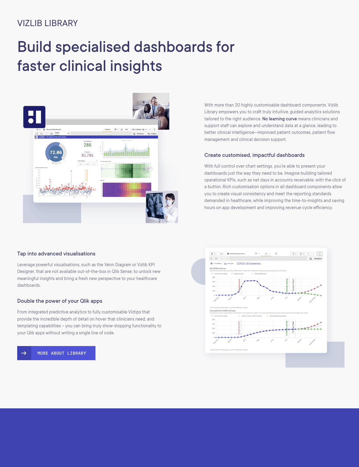
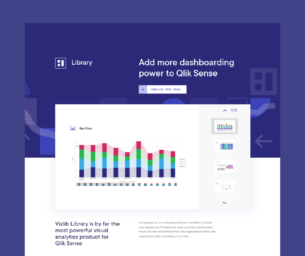
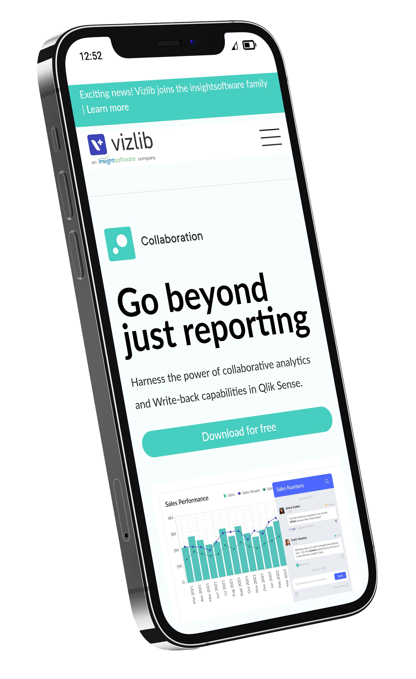
A light, clean interface for easy navigation
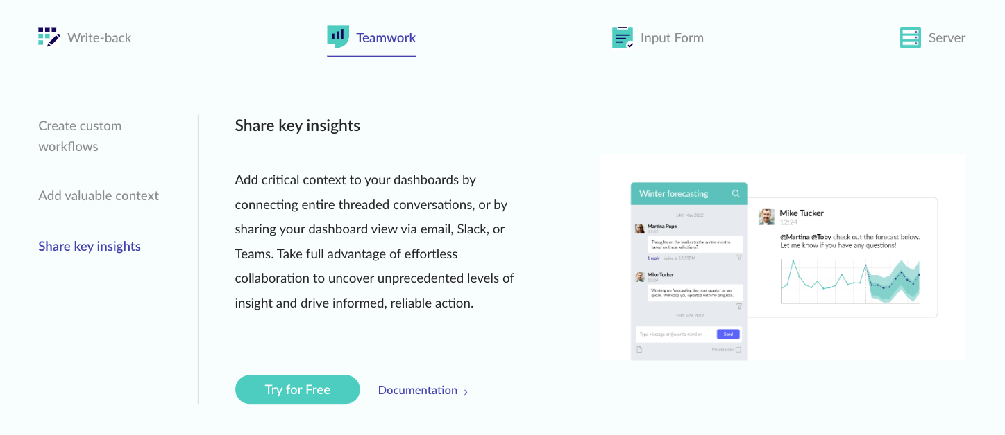
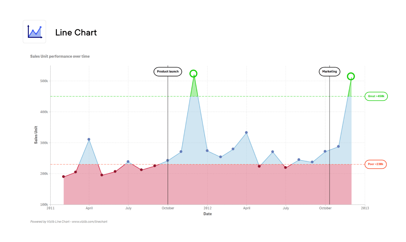
Crisp, uniform illustrations that showcase the UI
Dynamic motion graphics that capture attention
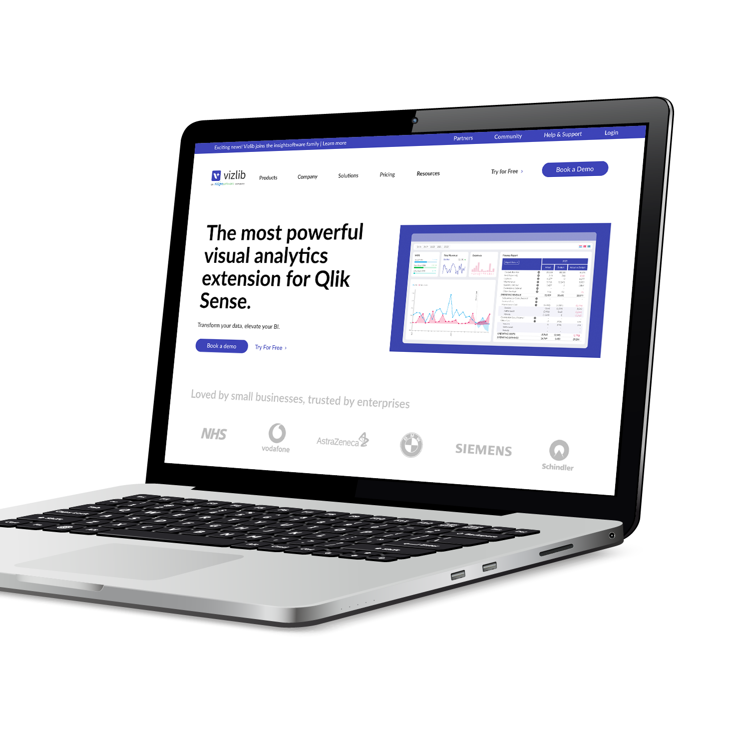
My animated hero image took centre stage on the main homepage, dynamically demonstrating Vizlib’s user interface at a glance.
Percentage of web traffic to MQLs:
Q3 2023 (old website):
4.58%
Q4 2023 (new website):
5.30%
Show, don’t tell
For me, the overarching theme of this landmark project became ‘show don’t tell’. We let the products do most of the talking by giving each page:
Clutter-free UI with space to breathe (directed by the web team)
Clean illustrations that highlight the very best features
Beautiful motion graphics that show the user interface in action
Simple copy and CTAs that inspire action (directed by the marketing team)
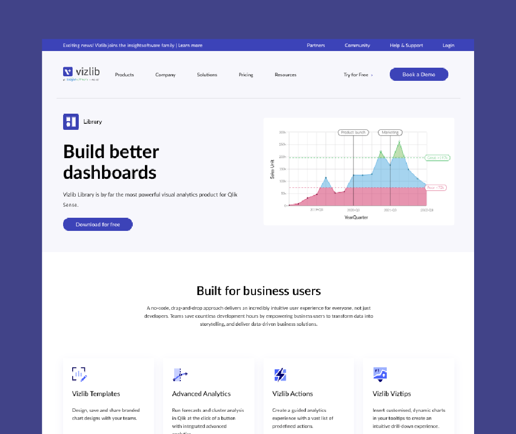
Old website
This static product screenshot is uninspiring and doesn’t provide any context about the product.
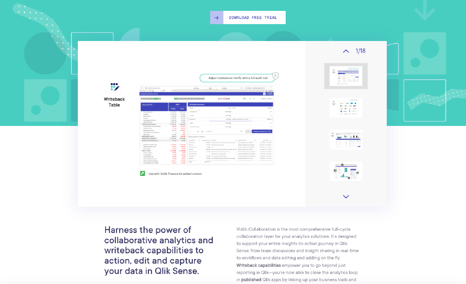
New website
An engaging animated mockup which showcases key features of the product.
120+ assets
In total, I produced over 120 assets for this project, including illustrations, motion graphics, thumbnails and icons.
I was responsible for all illustration, icons and motion graphics featured in this project. UX/UI by Clow Creative.
“Lizzy truly is a fantastic designer and a creative driving force.”
Jason / Senior Community Manager, Vizlib