
Data Visualisation, Social Media
Data storytelling that delivers maximum impact.
Benchmark Mineral Intelligence, 2024-2025
About Benchmark
Benchmark is the world’s leading price reporting agency (PRA) within the battery and energy supply chain space.
The brief
Using Benchmark data in infographics became an invaluable way to showcase the brand’s industry expertise to its ~42k LinkedIn followers.
I was frequently asked to produce impactful data visualisations:
To tell timely, relevant stories and stand out from the rest of the LinkedIn feed
To foster conversation, reactions and impressions on the platform by highlighting key trends and developments in the industry
To use these pieces as part of our wider brand advocacy strategy, allowing Benchmark analysts to repost and share with their own insights for even greater reach
Process & research
When sitting down to create an infographic, I always take the time to review and understand the data first. I’ll take a thorough look at any spreadsheets provided, highlighting key data points that may tell an interesting story. I’ll also collaborate with analysts, brainstorming and pitching ideas.
Visual exploration
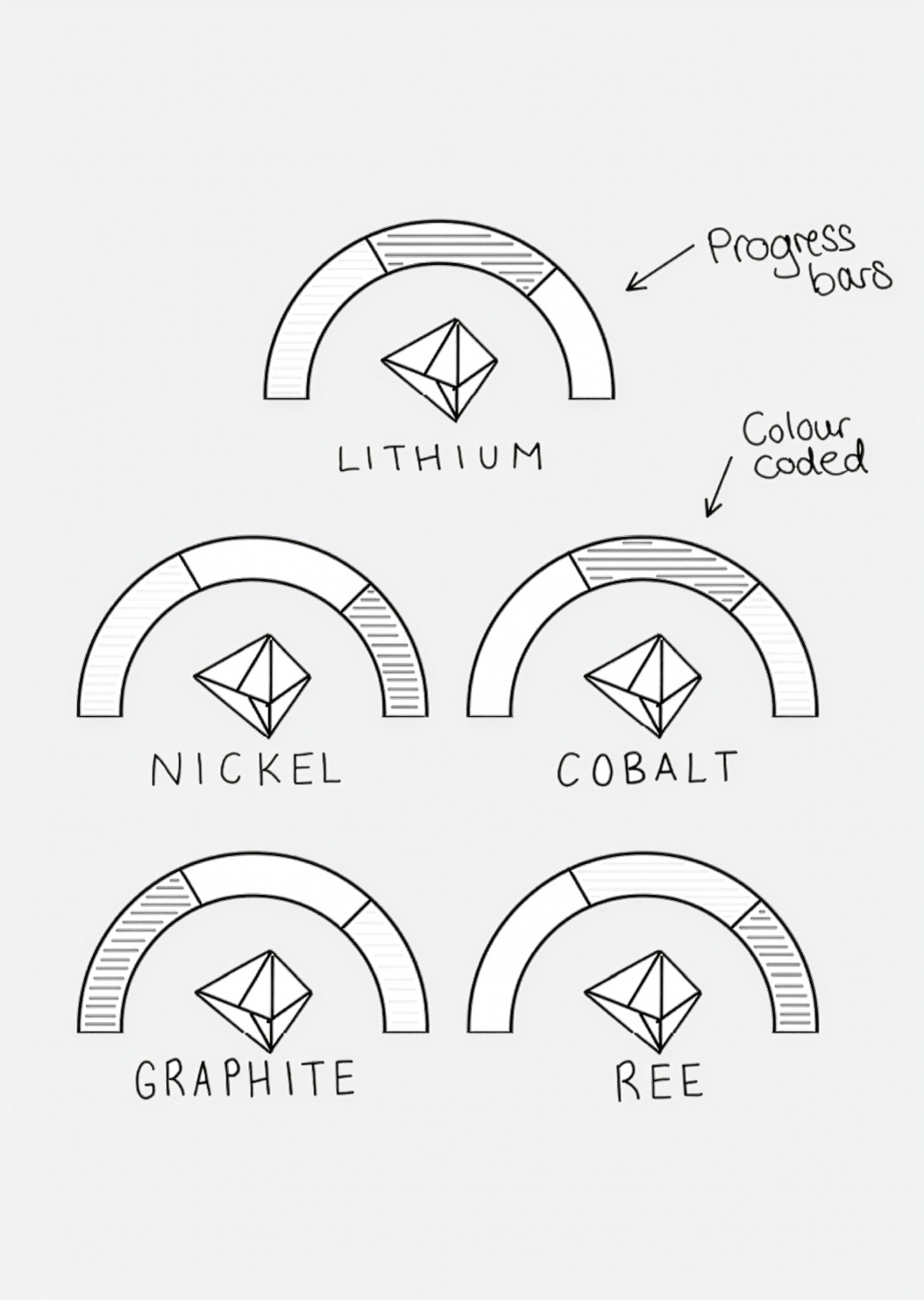
I’ll then put any potential ideas onto ‘paper’. This is a quick and rough process that allows me to explore how data points can be presented in different ways, and which layouts look most striking
I brainstorm as many ideas as possible - 3D, isometric and flat graphics, alongside various functional diagrams and charts, giving me the best overview of all the different visual directions I could take
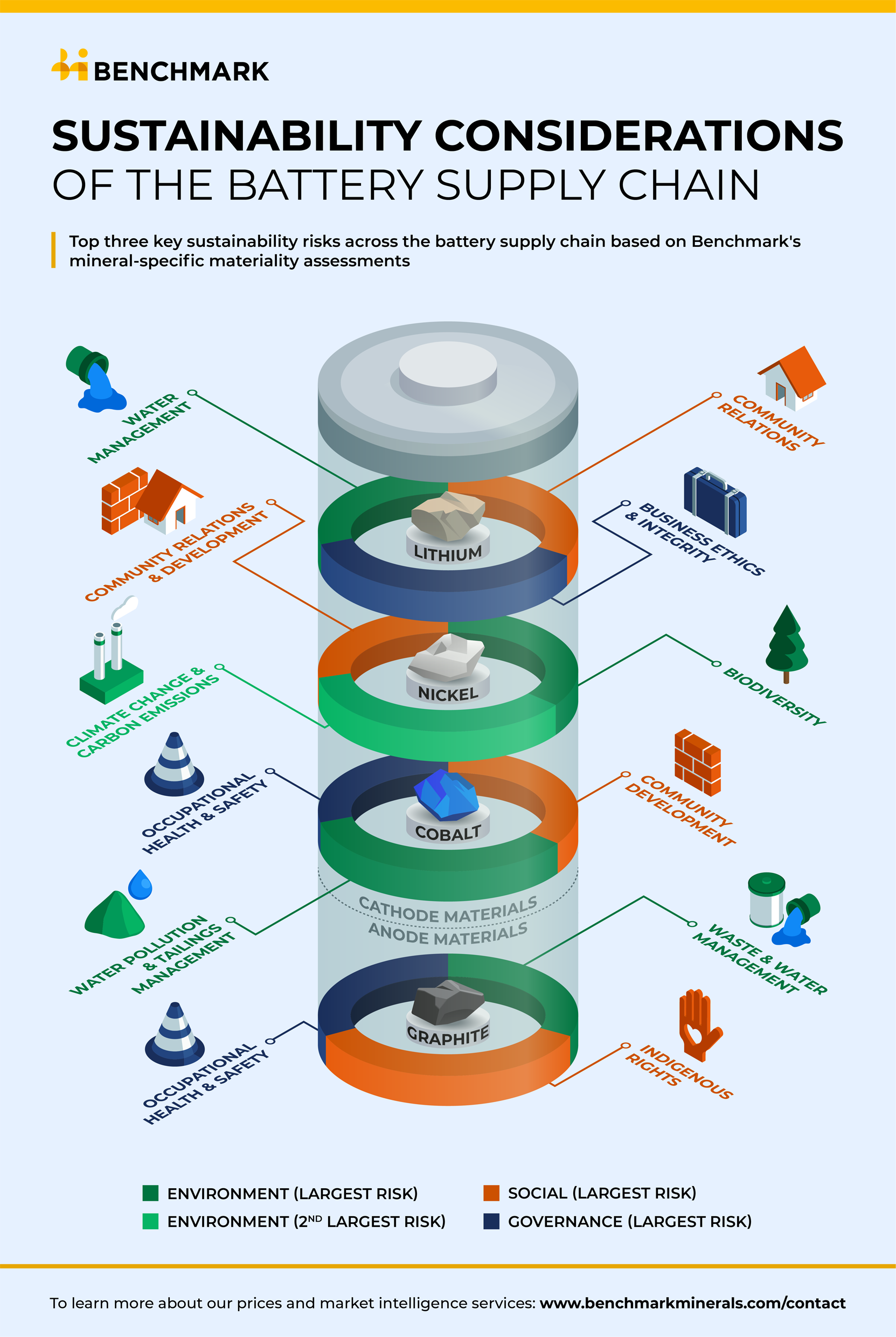
Here are some examples of my initial sketches for ‘Sustainability Considerations of the Battery Supply Chain’. Final piece can be found in the ‘Impact’ section
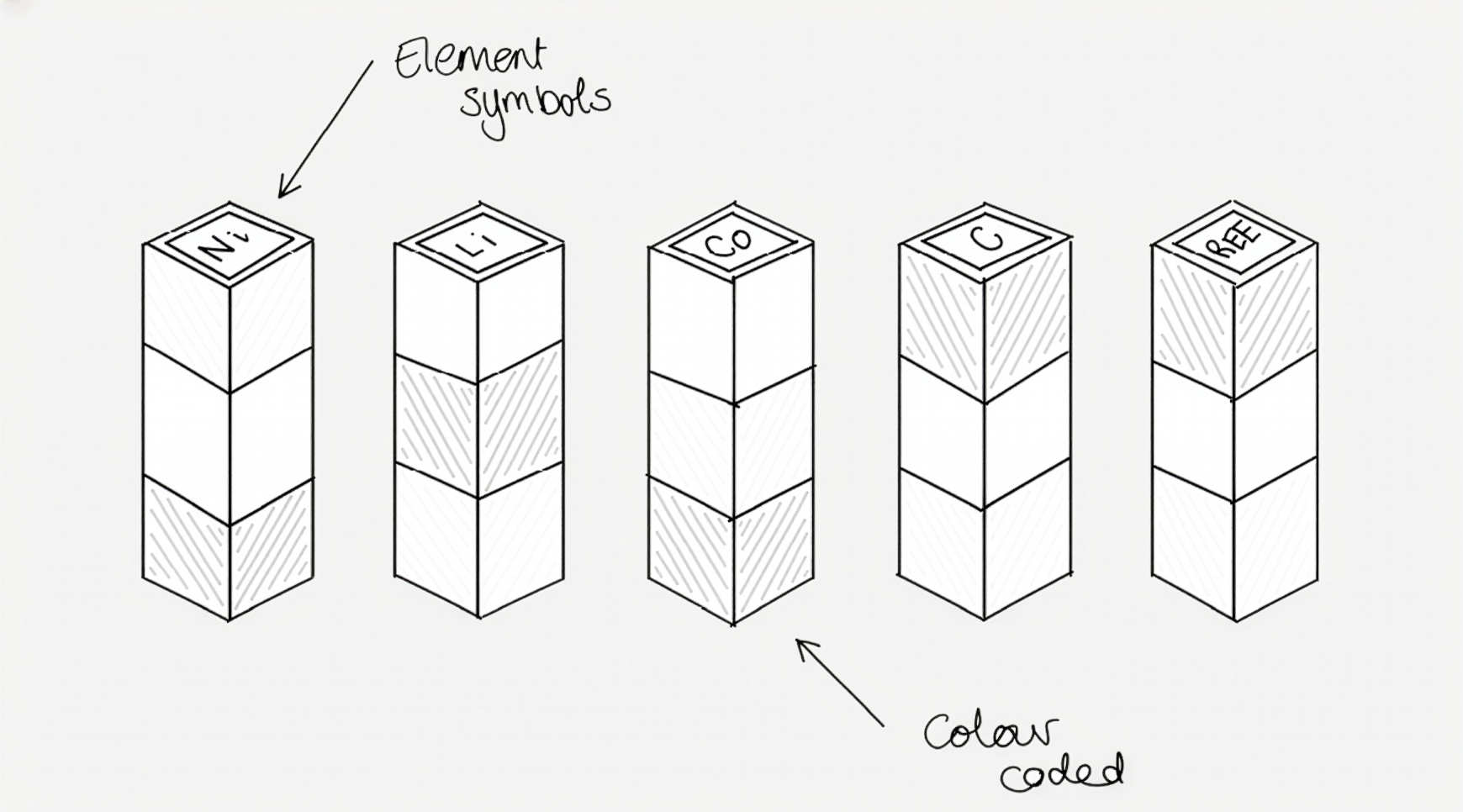
Option 1
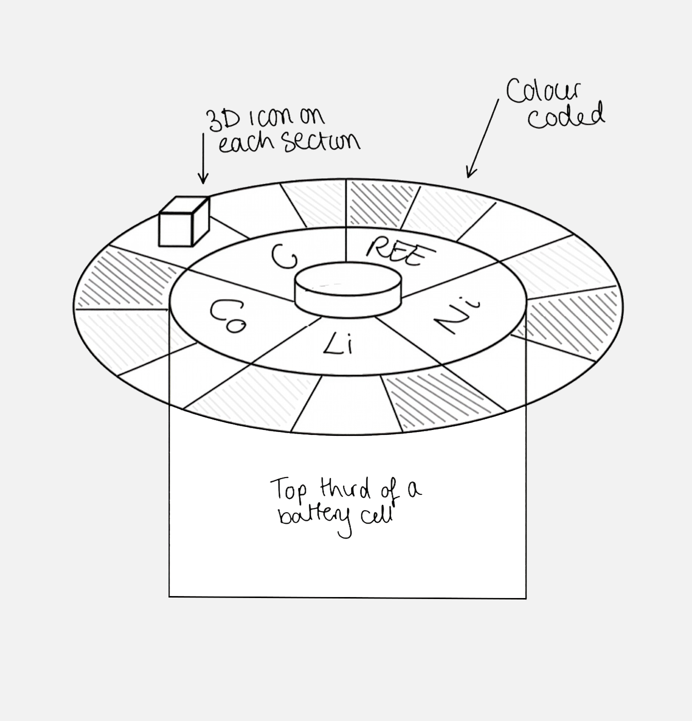
Option 2
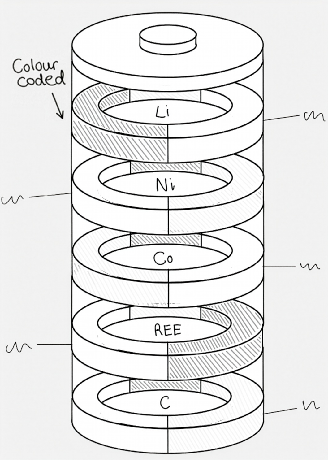
Option 3
Option 4
Solutions & impact
Below, you can find a selection of my favourite data visualisations from my time at Benchmark. Final LinkedIn metrics are indicated underneath each piece. Note that some of these were created prior to the Benchmark brand refresh, which is covered in more detail here.
Reactions: 527
Reposts: 39
Total impressions: +2306%
*Vs average impressions on Benchmark’s LinkedIn page
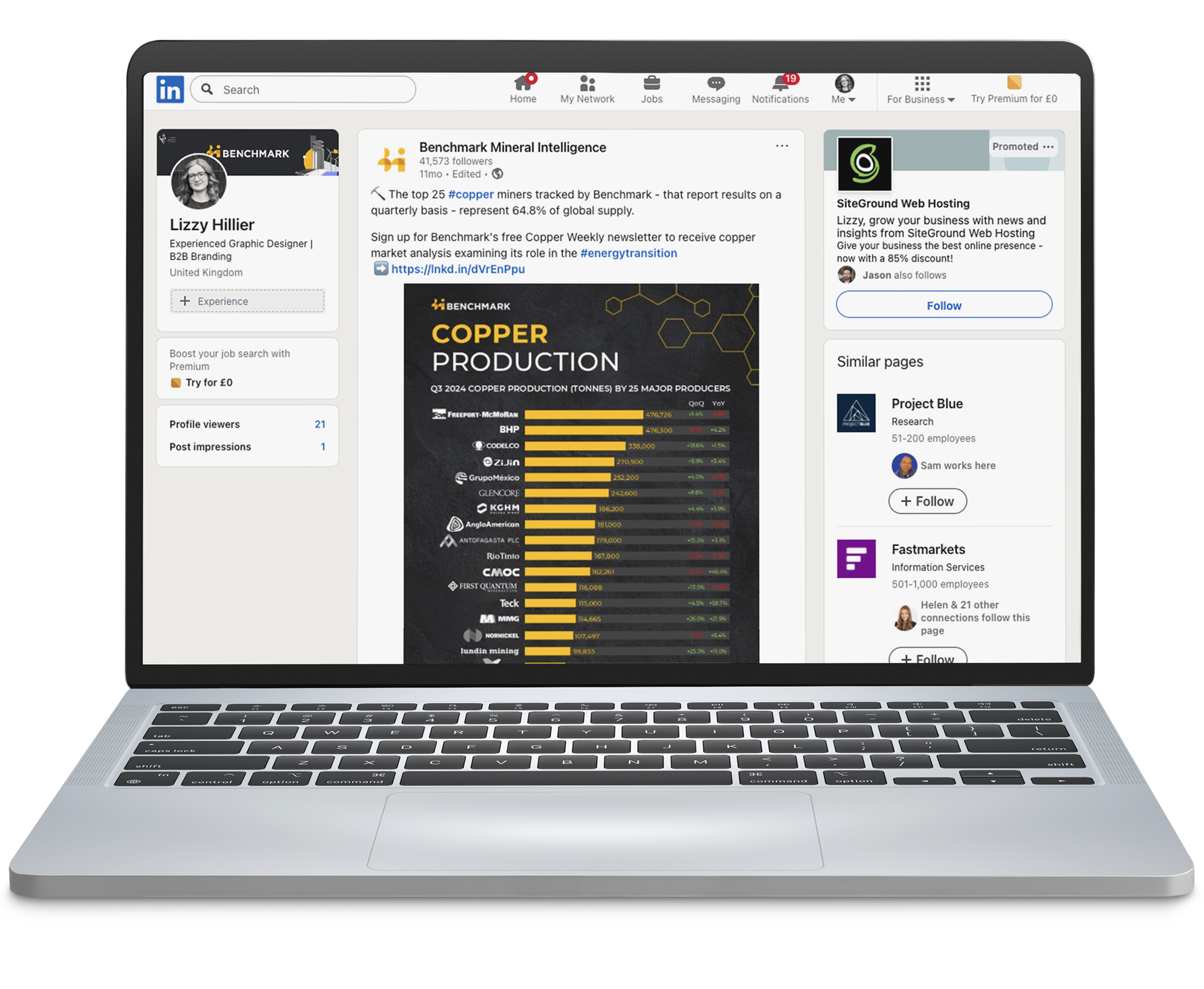
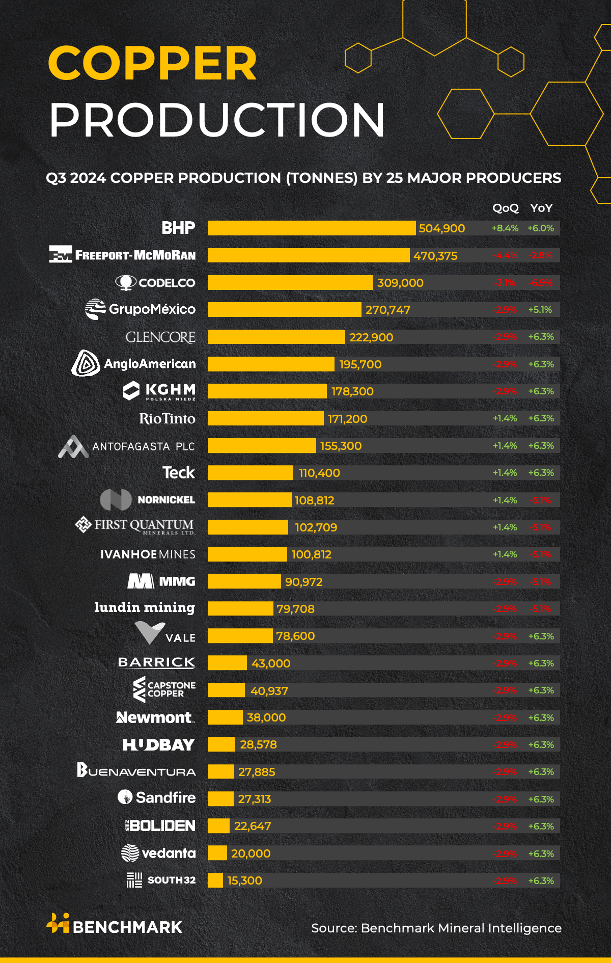
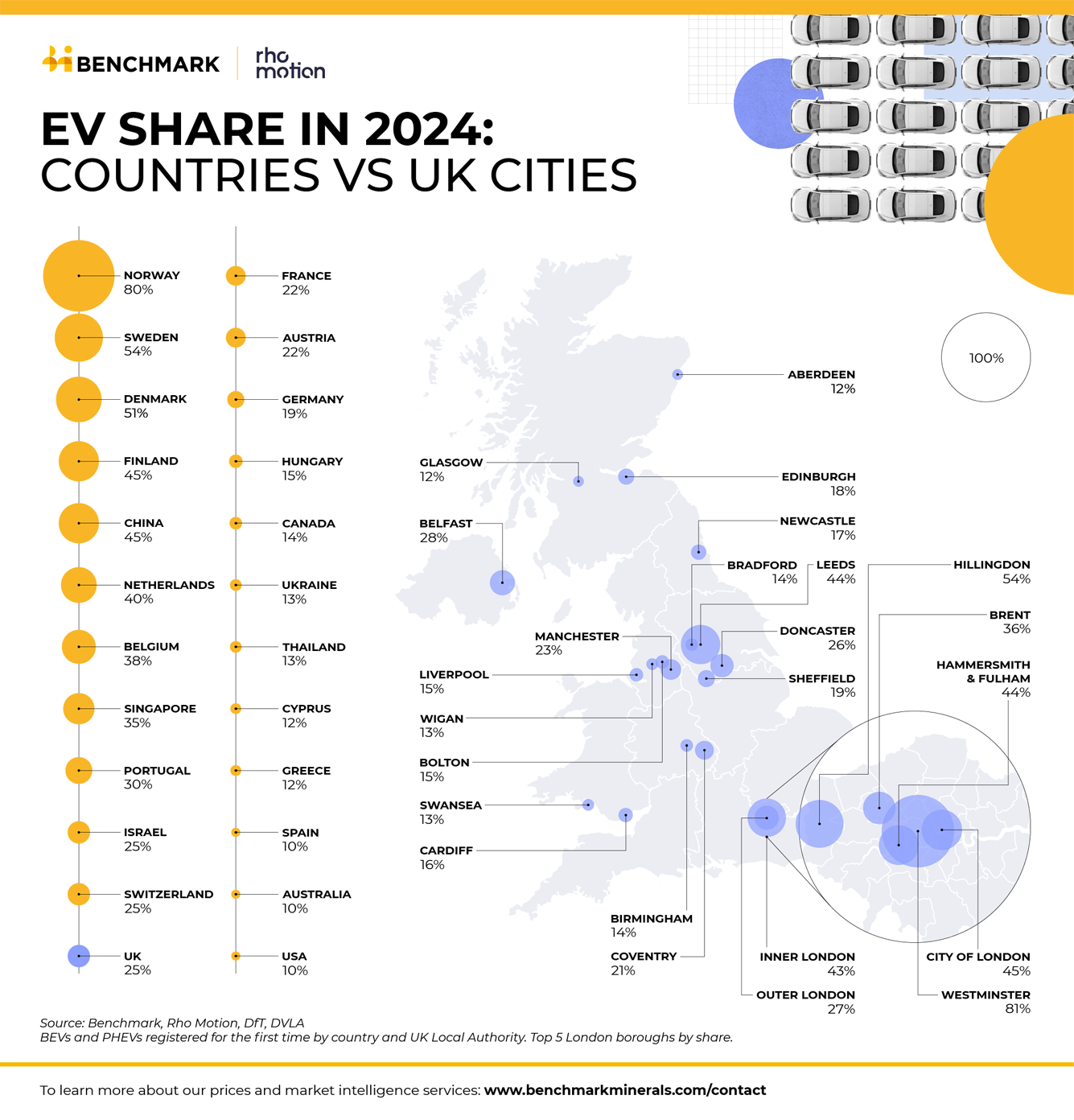
My most popular piece depicted Q3 2024 copper production. It was produced as part of a launch campaign for copper prices – which was at the time not yet covered by the brand
This initial infographic was so well received by followers and Benchmark analysts that it was repurposed on a rolling quarterly basis using a template
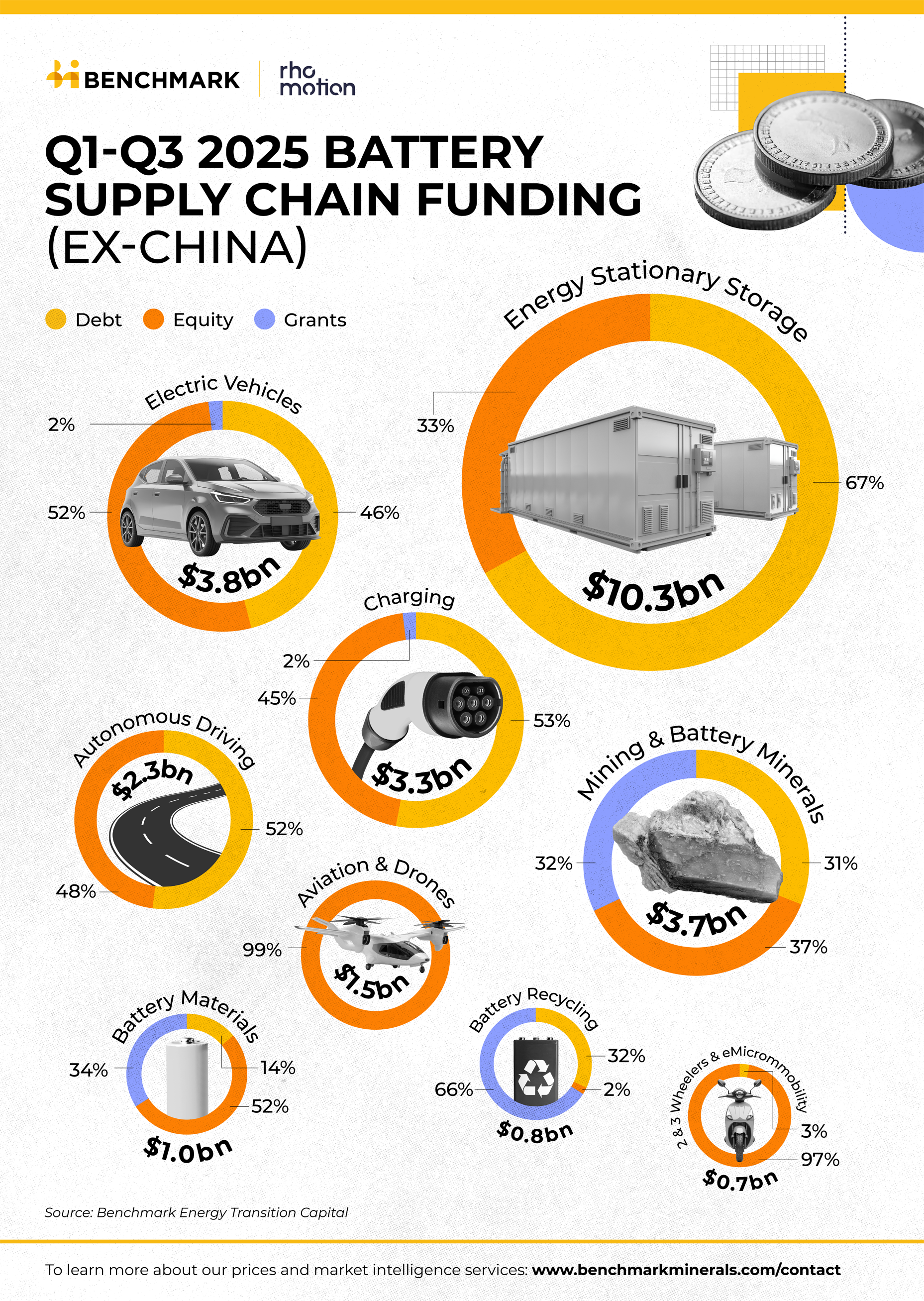
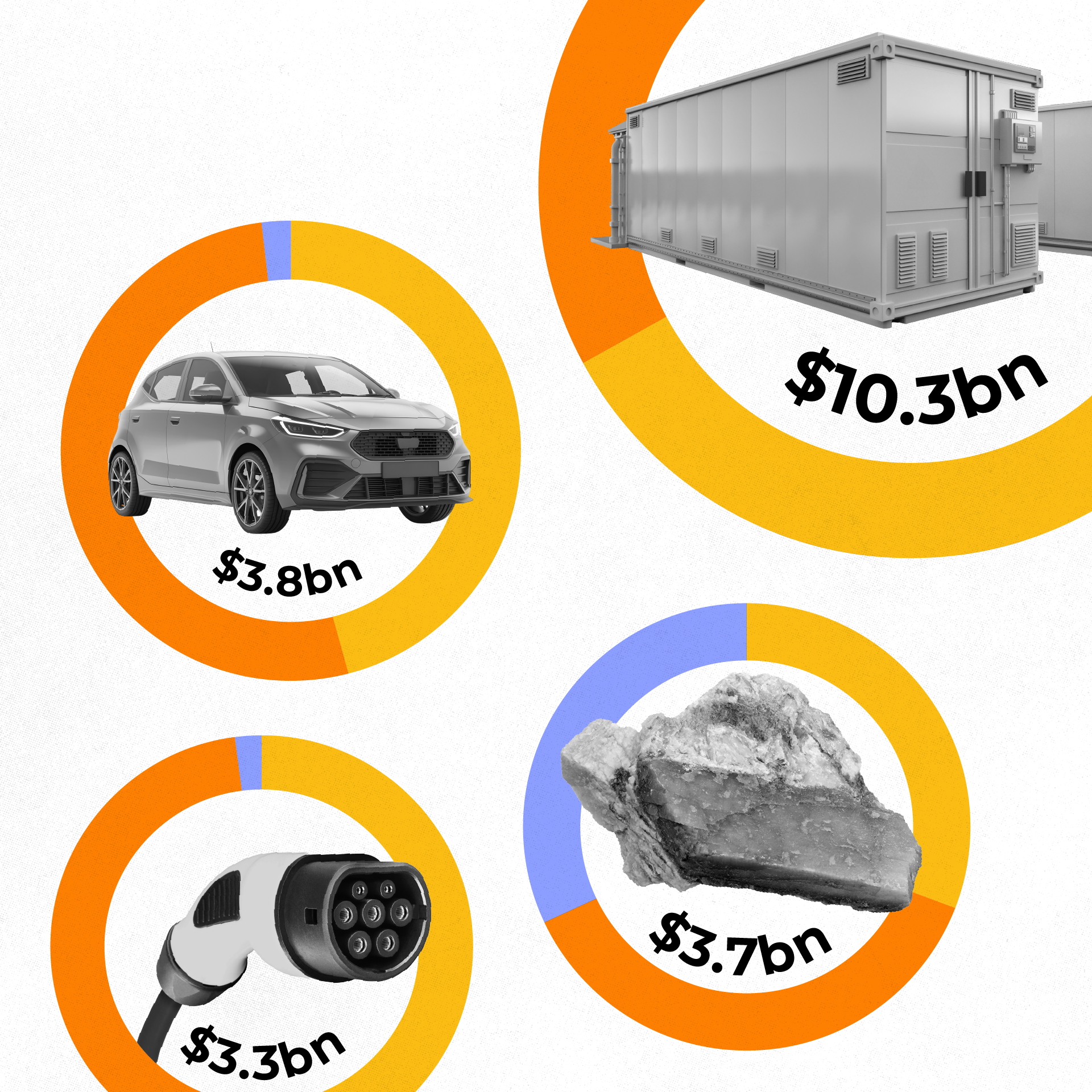
Reactions: 137
Reposts: 16 (via brand advocacy)
Total impressions: +1075%*
*Vs average impressions on Benchmark’s LinkedIn page
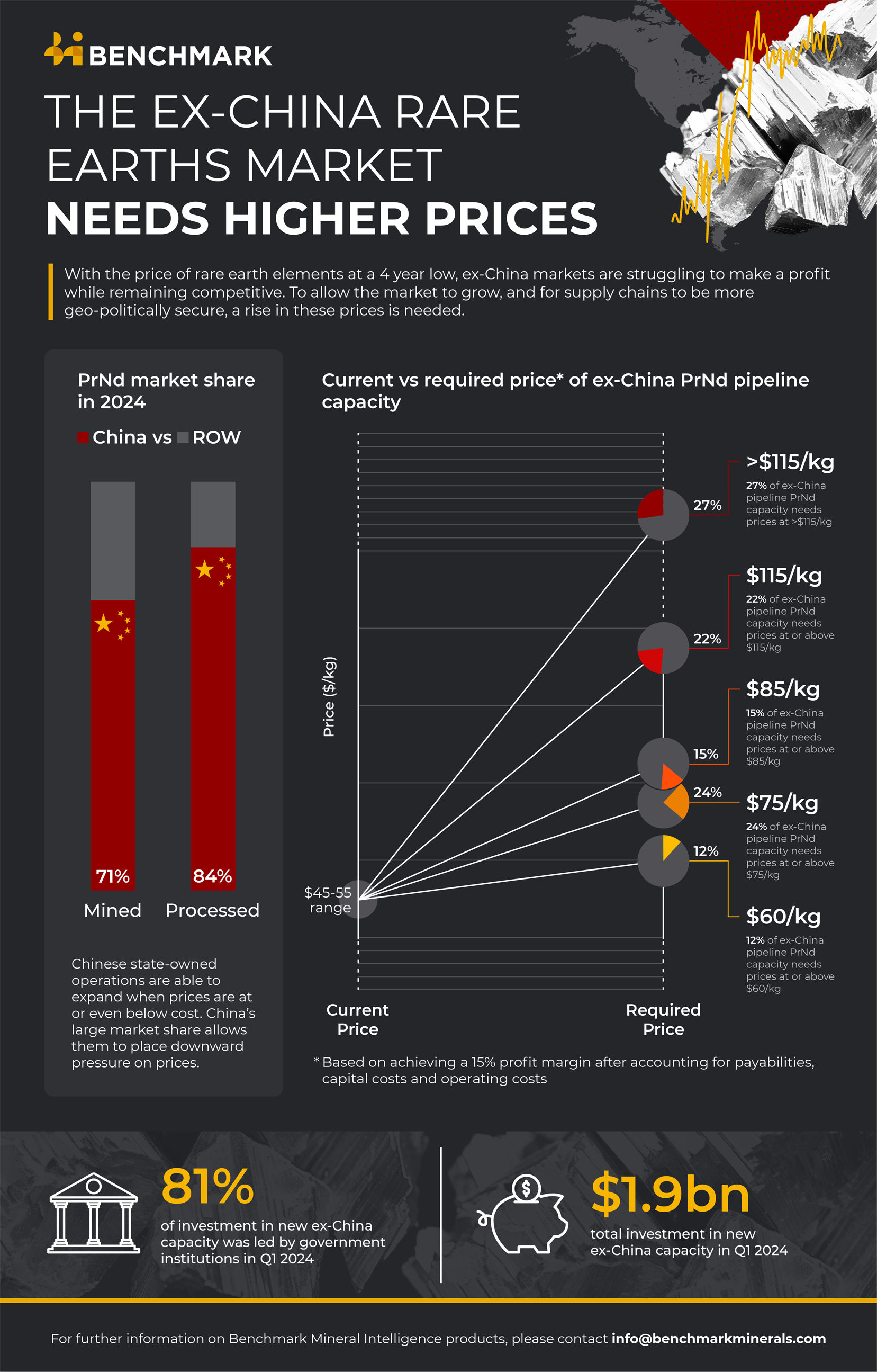
Reactions: 111
Reposts: 27
Total impressions: +649%*
*Vs average impressions on Benchmark’s LinkedIn page
Reactions: 43
Reposts: 6
Total impressions: +790%*
*Vs average impressions on Benchmark’s LinkedIn page
Reactions: 26
Reposts: 2
Total impressions: +392%*
*Vs average impressions on Benchmark’s LinkedIn page
“Working with Lizzy has been a true joy. She is one of the most hardworking, skilled and conscientious designers I have had the pleasure of meeting. Her ability to visually translate brand identity is second to none.”
Amelia / Senior Content Manager, Benchmark Mineral Intelligence